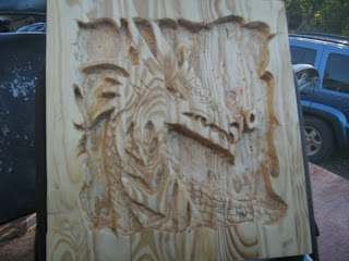


I call this The Taming of the Uni-Dragon because it kind of looks like a dragon slash unicorn. The inspiration for this probably came from having children and being an artist. My children have just brought the fantasy out in me.
The first 3 pictures are different angles without polyurethane and the last is with the polyurethane.
I wish I could of done a better job of cleaning it up because the corners were challenging. I hoped I could have made the bottom more level as well. However if I could go back and change anything it would be better teeth but they were hard and I kind of knocked a couple out.
It turned out to be a challenge for me but all in all I like it and I love the imperfections of it as well. Love a good ol challenge.

critique: I like that there are a lot of different points in the design, around the border and on the dragon itself. Great job on using the natural lines of the wood to give your image character.
ReplyDeleteI like the irregular border because I think it makes good use of your material since it was so large. I think the detailing of the dragon, especially the scales, turned out nicely. While I do feel that the grain of the wood gives the dragon a lifelike quality, I also feel that the dragon as a whole gets a bit lost in the details and heavily patterned grain of the wood. Lastly, is that a smoke puff coming out it's nose? At first I had thought that it was a nostril, but I'm not sure.
ReplyDeleteit looks good..you can definately tell you put alot of work into it with all the details..the drangon seems a little flat it may be the pic but I think that maybe making some of the sharper edges a little rounder would have looked good too!
ReplyDeleteI agree with Nichole about making some of the sharper edges smoother. I like your how you did the border. Looks great!
ReplyDeleteI saw this towards the beginning adn it has come so far. I love how you did the border, especially... as well as the scales. I agree that some aspects could be smoother, but the whole appearance gives it a sort of dangerous look, which seems to fit perfectly with the image itself.
ReplyDeleteI really like the border, and I know that you were saying that it was really hard. I also like the addition of the different textures that you applied to create the scales.
ReplyDelete